I recently started working on a new showreel. After creating a few new scenes, I started rummaging through my Blendfile folder to see if there was some unfinished stuff that I could use.
I stumbled onto files from my first ever showreel, which I thought were pretty neat at the time. Remember that was a long time ago. Anyways, it was all rendered in Blender Internal Renderer, so I decided to migrate some of them to Cycles. And it was well worth it.
Here is my locust in Blender Internal:

And here it is "remastered":

Of course I know SSS would have been available in BI as well, but I didn't manage to make it look good. This actually illustrates my next point which would be: revisiting previous works is not only about porting them to Cycles, it is also about applying new techniques to similar situations. You can actually learn a lot from this process, about your improvement as an artist, as well as Blender's improvement as an artist's tool.
Here's another example:
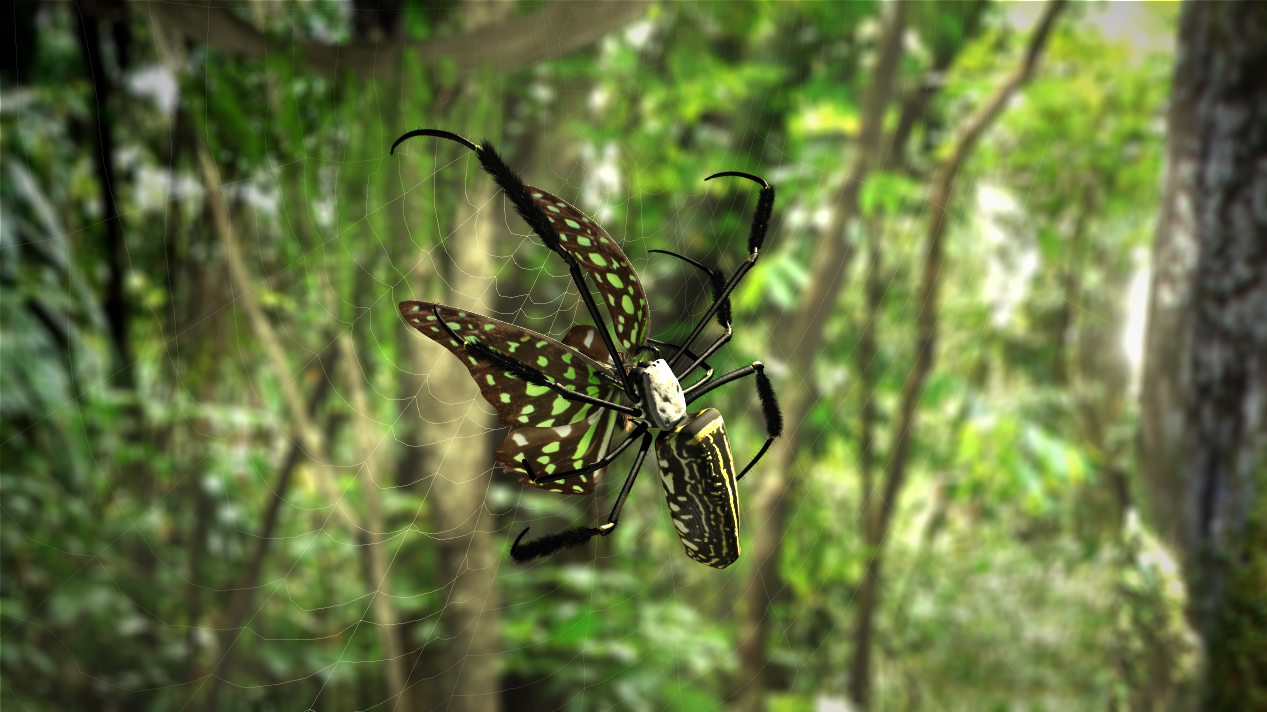
Revisited with Cycles it turned out like this:
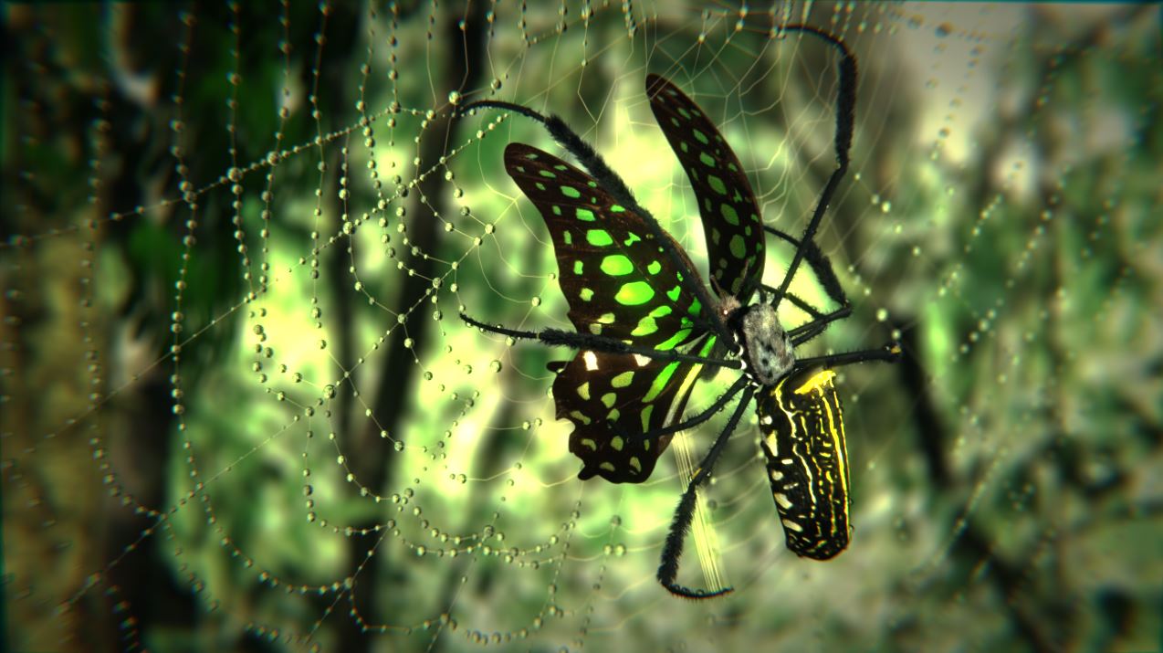
Getting to the next point I am trying to make. Chances are that not only technology has improved, but also your skills in lighting and compositing. While having a look at past projects, there might be another thing you notice. The scene was ok-ish, but when I redid the materials in Cycles, I also thought some dew drops might spice up the image. To be honest I actually put these in in BI as well, but they looked a bit off.
Which brings me to the last example I want to show you in this article. Both of the following renderings were done in Cycles and I did the second one not very much later than the first one.

And just a few days later it looked like this:

It is still a WiP, but there is only one major difference between the pictures. I was testing out the new Principled shader that is actually supposed to replace the diffuse shader as a default. I was adding shaders, combining them in different ways, but I was not really improving anything. I am not saying this look wasn't possible in Cycles before, but first, almost all materials in the scene only use one shader, which makes them a lot more tidy. Secondly, toying around with the values is much more efficient if you have them all in one place. Keep in mind I did not change anything about the textures. Personally, I especially love the clearcoat option.
This is also why we put a very detailed analysis of this new shader into the Cycles Encyclopedia. We address the differences between recreating the shader from a mix of previously existing ones as well as tons of testrenders into our book. We even explain some of the math behind the values. If you have already purchased the Cycles Encyclopedia at an earlier point, this update will be free. If you haven't, we highly recommend it, because it will speed up your workflow and deepens your understanding of the possibilities that Cycles offers.


